|
2/28/2018 0 Comments February 28th, 2018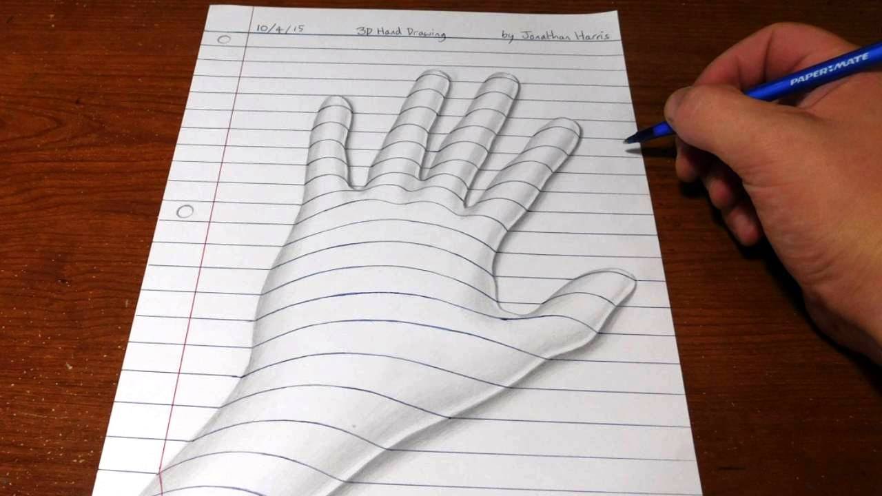 Following a similar topic to Escher, I decided to talk about pictures or drawings that pertain to the "optical illusion" genre. Here, we have 3D art. I like how the illustration itself is in a 2D style, but the artist used appropriate amounts of shading in order to make this otherwise 2D image have the appearance of popping out of the paper.
0 Comments
2/27/2018 0 Comments February 27th, 2018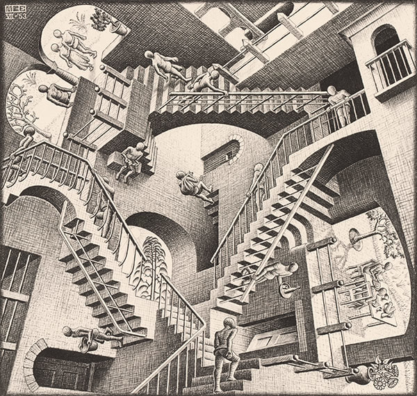 This is another work by M.C. Escher. As stated in the previous entry, this is a prime example of how his works portray optical illusions. The work itself is very abstract, leading the viewer to question which direction is which: Which way is up? Which way is down? Such questions are what capture the interest of the viewer.
2/27/2018 0 Comments February 26, 2018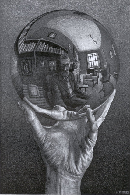 This week's artist is M.C. Escher. His artworks mainly portray subjects pertaining to science, such as optical illusions.
The picture shown above is one such example. In a way, the photo has a sort of philosophical message which is seen with the reflection of the ball, which is the main focus of the photograph. Due to the lack of colors, the viewer is compelled to focus on the object included, such as the hand, the ball, and the reflection in that ball. 2/23/2018 0 Comments February 23rd, 2018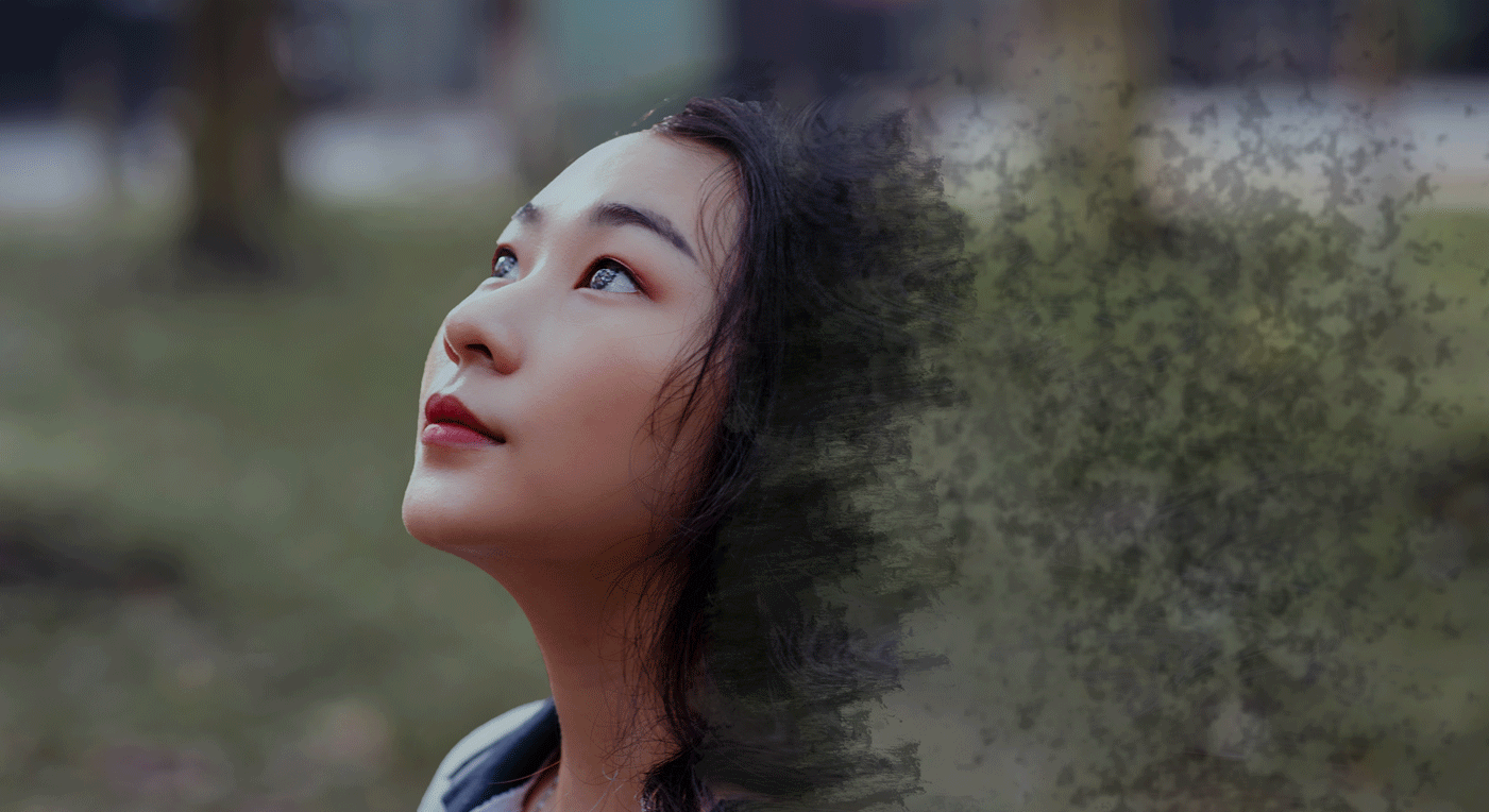 This was the project I tried to do using the last photo. As you may guess, it's not exactly my best work. There were many instances of trial and error. Because of this, the end result was not that great. To start off, I need to download better brushes in order to portray the particles better.
2/23/2018 0 Comments February 22, 2018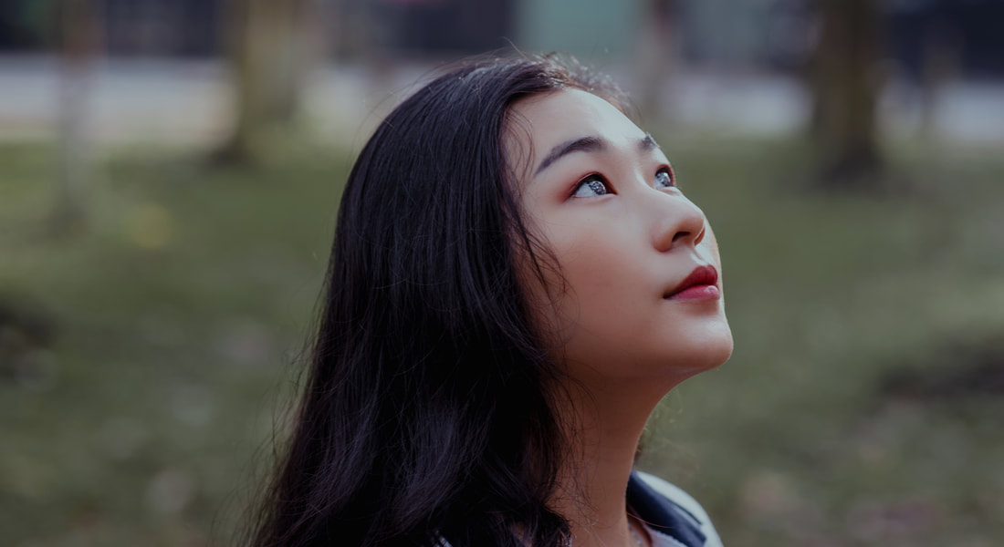 My main reason for using this photograph is because I plan to use it as a template for a project I will try to attempt. Before I do so, I want to comment on this photo beforehand. First of all, this is a royalty free photo, meaning that I can use it without the worry of any repercussions. Besides that, one aspect I like from this photo is the model's eyes. It's made in a way that they look a bit glassy, or sparkly. Either way, it's a nice aesthetic.
2/22/2018 0 Comments February 21, 2018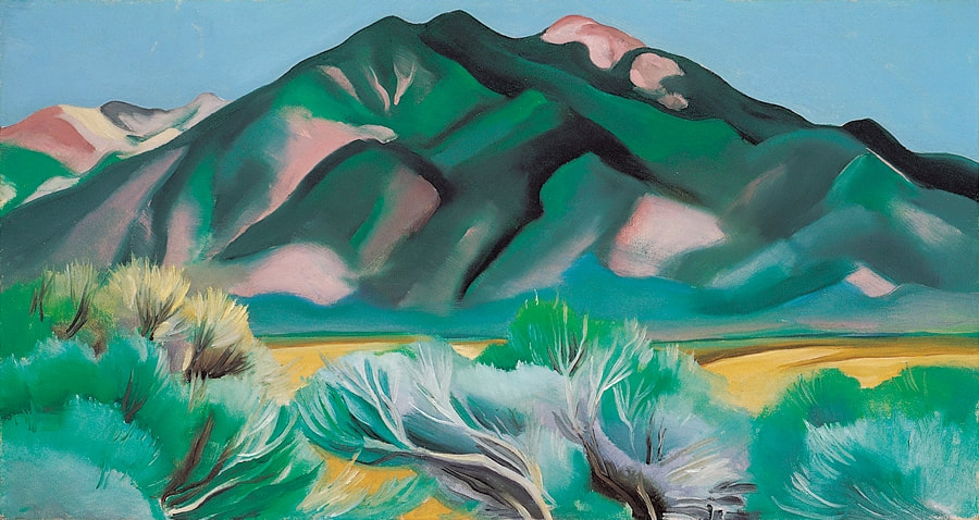 Out of the very few artworks I've seen from O'Keeffe, this one is probably my most favorite. I've always been a fan of any depiction of the beauties of nature, and this captures it perfectly. It gives me the impression that a photograph of this specific scene was taken and converted into a painting. The greens depicting the brushes and the mountains accompanied with the yellows signifying a desert makes this seem like an oasis of sorts.
2/20/2018 0 Comments February 20th, 2018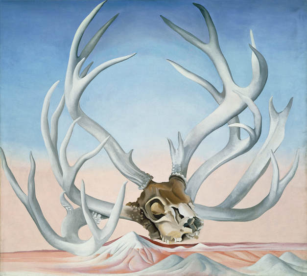 This is an artwork by Georgia O'Keeffe. After observing a few of her artworks, it can be seen that she likes to use a lot of dark imagery, as seen with the cow skull, which is featured in a few of her works. In these types of paintings, the colors are the main focus. In this specific work, the whites contrast a lot with the brown from the skull, while at the same time blending well with the reds and blues of the background.
2/15/2018 0 Comments February 15th, 2018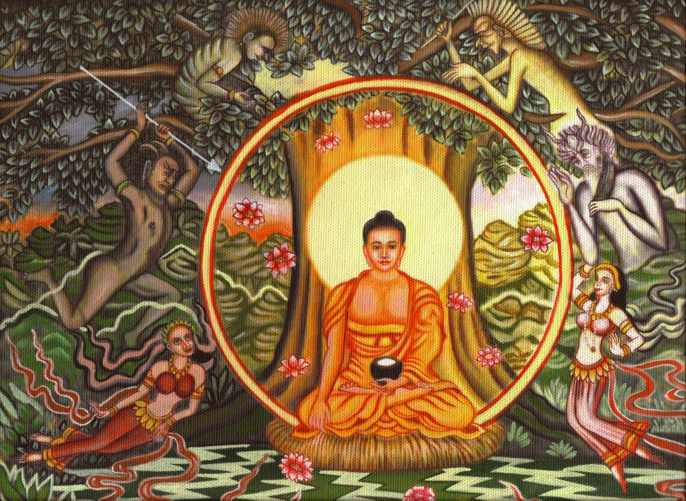 I may get in trouble for posting about something like this, but I would like to talk about the topic of religious art. The purpose of this is to not reveal what religion I follow or even praise a specific religion. I chose this specific artwork simply because I want to comment about what I like about it. With that being said, I like the symbolism being represented in this painting. As you might know, Buddhism, in which this is based off of, is one of the religions that emphasizes the battle between good and evil. With this in mind, I like how to "good" figure (center) is surrounded in a lighter shade, while the "evil" forces (outer) are portrayed in a darker shade. In addition to this, I also liked how it followed the tradition of religious style art and gave Buddha a halo. This is a practice famously seen in artworks pertaining to Christianity.
2/15/2018 0 Comments February 14th, 2018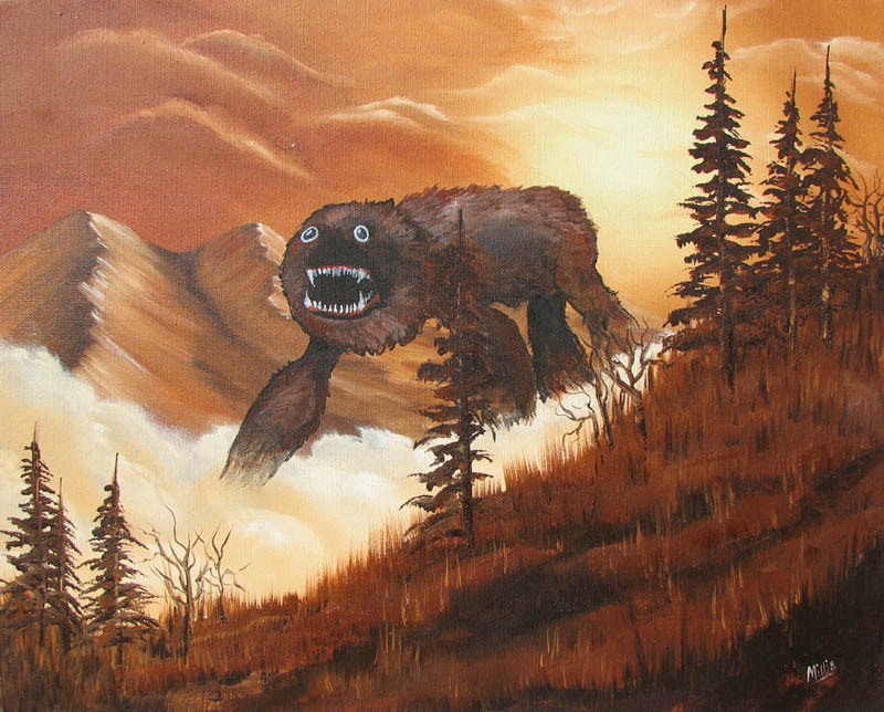 This painting personally made me laugh. I like how the giant monster acts as a diffusion to the natural beauty of the landscape. The two main subjects really juxtapose each other. I mean, look at the monster's face. It's very derpy! I am unsure as to whether this was an original done by the author or if it parodies off of another's, but to the artist that did this, good job. You made my day with this painting. Thank you for brightening my otherwise depressing day.
2/15/2018 0 Comments February 13th, 2018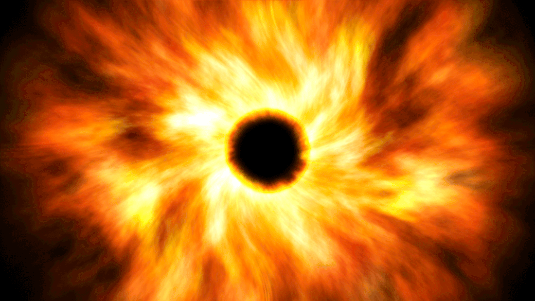 This was an original work I did using photoshop. I personally like what I did, but I am fairly certain that others may disagree. Despite what they may say, however, I am proud of my work and the effort I put into this. For example, I like what I did with the juxtaposing elements between the bright colors in the center and the enveloping blackness surrounding it.
|
