|
5/3/2018 0 Comments May 03rd, 2018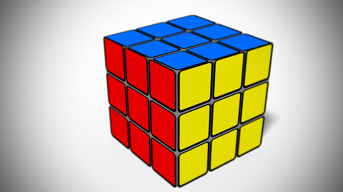 This is the related project I mentioned last post. As a whole, i'm proud of this. The colors chosen for the cube aren't too flashy or distracting, and it's an accurate color for the type of cube that it was designed for. It's also, for the most part, centered on the picture. If there's one thing I would change it would be to perhaps add a background of some sort to fill in the white spaces. I do not know if that would make the photo better, but it seems like a logical decision at the moment.
0 Comments
Leave a Reply. |
