|
5/11/2018 0 Comments May 11th, 2018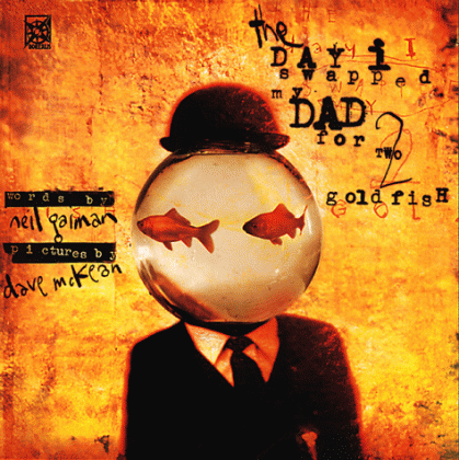 Digital media is an interesting concept, as it can be used to make something as archaic as this. This look like something you would see as the cover art of a horror movie poster. The font, the color, and the weathered look all give it an eerie image.
5/10/2018 0 Comments May 10th, 2018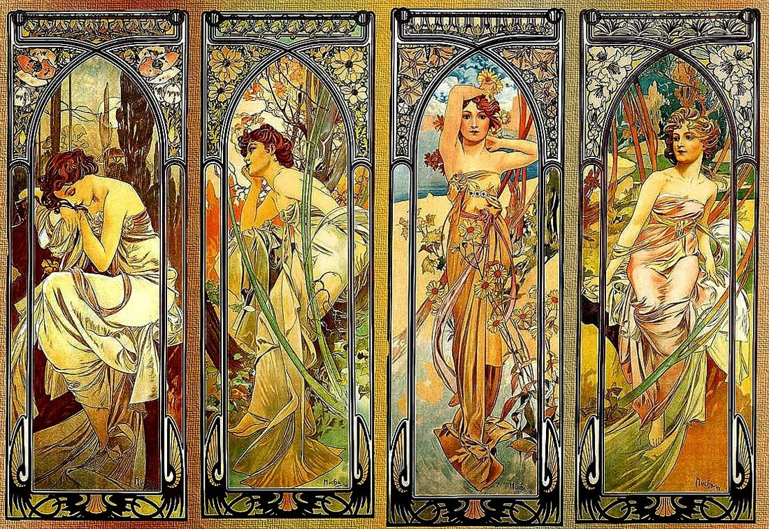 It's neat how Mucha's artworks give the impression of spiritual themed art. It look like something one would see in a pack of tarot cards. Add some text to the top, and these images could easily pass as one.
5/9/2018 0 Comments May 9th, 2018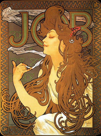 This week's artist is Alphonse Mucha. He mainly deals with digital media, often seen as the interconnection between text and digital art. As seen by the picture, the text is neatly interwoven within the subject of the picture, giving a natural image.
5/8/2018 0 Comments May 8th, 2018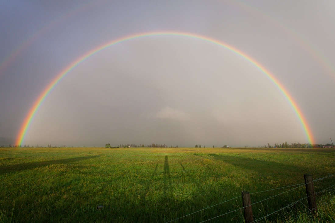 The rainbow is centered neatly upon the picture, signifying the neatness of the composition held within the piece. The shadows seen on the foreground give a mysterious appeal to the meadow. Double rainbow all the way across the sky, bebe.
5/7/2018 0 Comments May 07th, 2018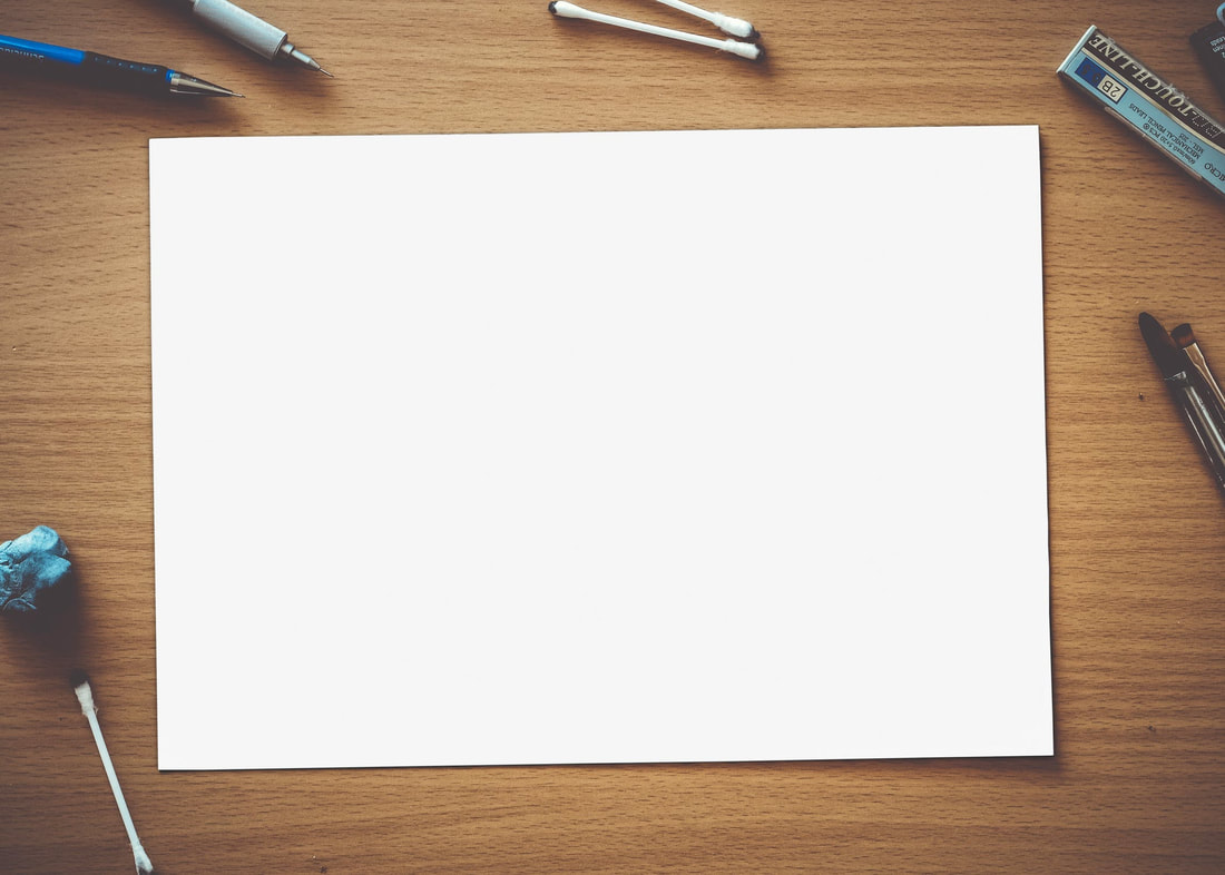 This is a piece of paper that is the result of the processing of the wood. As it was a high quality wood, it goes to show that it would yield some high quality paper. The whiteness of this paper is very white. It's centered on the portrait further accentuating the whiteness, along with the squareness of the piece. Indeed, this paper is, arguably the highest quality paper to have ever been made by the highest quality wood.
5/4/2018 0 Comments May 04th, 2018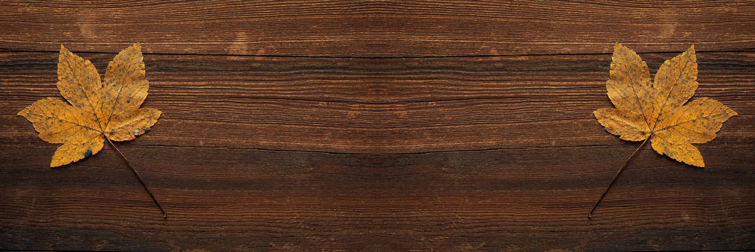 This is a picture of wood. The best wood. No one can beat this wood. The amount of brown on the wood is so vivid. The lines shaping the outline of the wood gives it a flavorful appeal. The hints of whites on the sides of the wood make it even more realistic. The leaves that compliment the wood just adds to the immersion. This wood is, without a doubt, the best wood to have ever wood.
5/3/2018 0 Comments May 03rd, 2018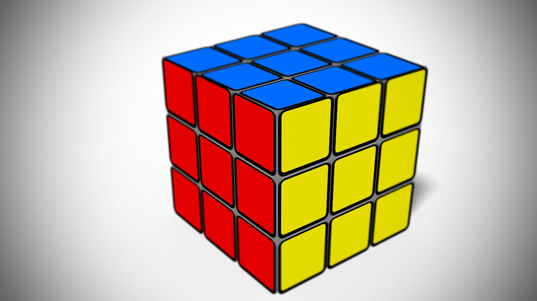 This is the related project I mentioned last post. As a whole, i'm proud of this. The colors chosen for the cube aren't too flashy or distracting, and it's an accurate color for the type of cube that it was designed for. It's also, for the most part, centered on the picture. If there's one thing I would change it would be to perhaps add a background of some sort to fill in the white spaces. I do not know if that would make the photo better, but it seems like a logical decision at the moment.
5/2/2018 0 Comments May 02nd, 2018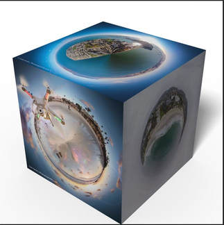 This is a 3-D effect created by photoshop. The main reason for making a post upon this topic is because of a related project i'm currently working on. The best part about this is the concept: The fact that it takes multiple worldwide pictures and compiles them onto a cubic shape creates a large contrast to the otherwise round shape that earth should be in.
5/1/2018 0 Comments May 01st, 2018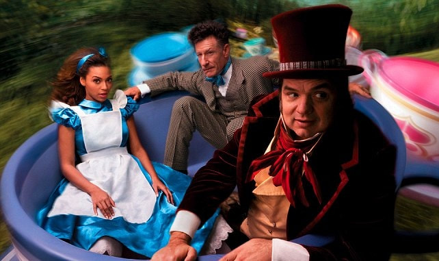 This week's artist is Annie Leibowitz. Evidently, her topic is photography.
In regards to the photo, the composition is very well done. Each actor is centered in the photo, with the background being blurred out in order to add emphasis to the subjects. Additionally, I like the theme of the picture. The Alice in Wonderland costumes evenly match the colorfulness of the teacups. |
